The French Government has released 20 years of crime statistics as open data (though it comes in Excel format). I've played a bit with the data to see how crime has changed with time. As always, let's use R for this (and here is the code if you want to run it on your computer).
Let's start by loading the necessary libraries and data:
library(xlsx)
library(reshape2)
library(XML)
library(RCurl)
library(ggplot2)
theme_set(theme_bw(14))

crime <- read.csv("data/Tableaux_4001_TS_1.csv", header = TRUE,
                  stringsAsFactors = FALSE)
crime$Index <- NULL
crime <- melt(crime, id.vars = c("Libellé.index"))
names(crime) <- c("Crime", "y_m", "number")

# Let's build a proper year var
crime$y_m <- gsub(pattern = "X", replacement = "", x = crime$y_m)
crime$year <- sapply(crime$y_m,
                     function(x) as.numeric(strsplit(x, "_")[[1]][1]))

# Compute the average crime for that label for that year
crime_avg <- aggregate(number ~ year + Crime, crime, mean)
So far, nothing too fancy. Right now we have a data.frame object that looks like this:
> head(crime_avg)
  year                          Crime   number
1 1996 Achats et ventes sans factures 62.75000
2 1997 Achats et ventes sans factures 58.58333
3 1998 Achats et ventes sans factures 45.25000
4 1999 Achats et ventes sans factures 42.33333
5 2000 Achats et ventes sans factures 38.91667
6 2001 Achats et ventes sans factures 32.16667
I've averaged the crime data per year (it comes per month) to obtain a more or less accurate estimation of the incidence of that offense.
The problem with this is that the French population grows with time. So 62 crimes in 1996 in all France might be much, much lower than the same amount in 2014, in percentage.
As I think this is relevant when looking for patterns in the data, I've obtained the French population directly from this Wikipedia page, much like I did with the James Bond plot:
wikidata <- getURL("https://en.wikipedia.org/wiki/Demographics_of_France")
population <- readHTMLTable(wikidata, stringsAsFactors = FALSE)[[4]]
population <- data.frame(year = as.numeric(population[, 1]),
                         pop = as.numeric(gsub(" ", "", population[, 2])))
Well, that was fast. I can now merge all my datasets into one and obtain the crime numbers for 1996 and 2014.
crime_avg <- merge(crime_avg, population)
crime_avg$norm_crime <- crime_avg$number / crime_avg$pop
crime_first <- crime_avg[crime_avg$year == 1996, c(2, 5)]
crime_last <- crime_avg[crime_avg$year == 2014, c(2, 5)]
names(crime_last) <- c("Crime", "norm_crime_last")
crime_diff <- merge(crime_first, crime_last)
crime_diff$diff <- 100 * crime_diff$norm_crime_last / crime_diff$norm_crime
crime_diff <- crime_diff[complete.cases(crime_diff), ]
crime_diff$Crime <- factor(crime_diff$Crime)
crime_diff$Crime <- reorder(crime_diff$Crime, crime_diff$diff)
crime_diff$col <- crime_diff$diff > 100
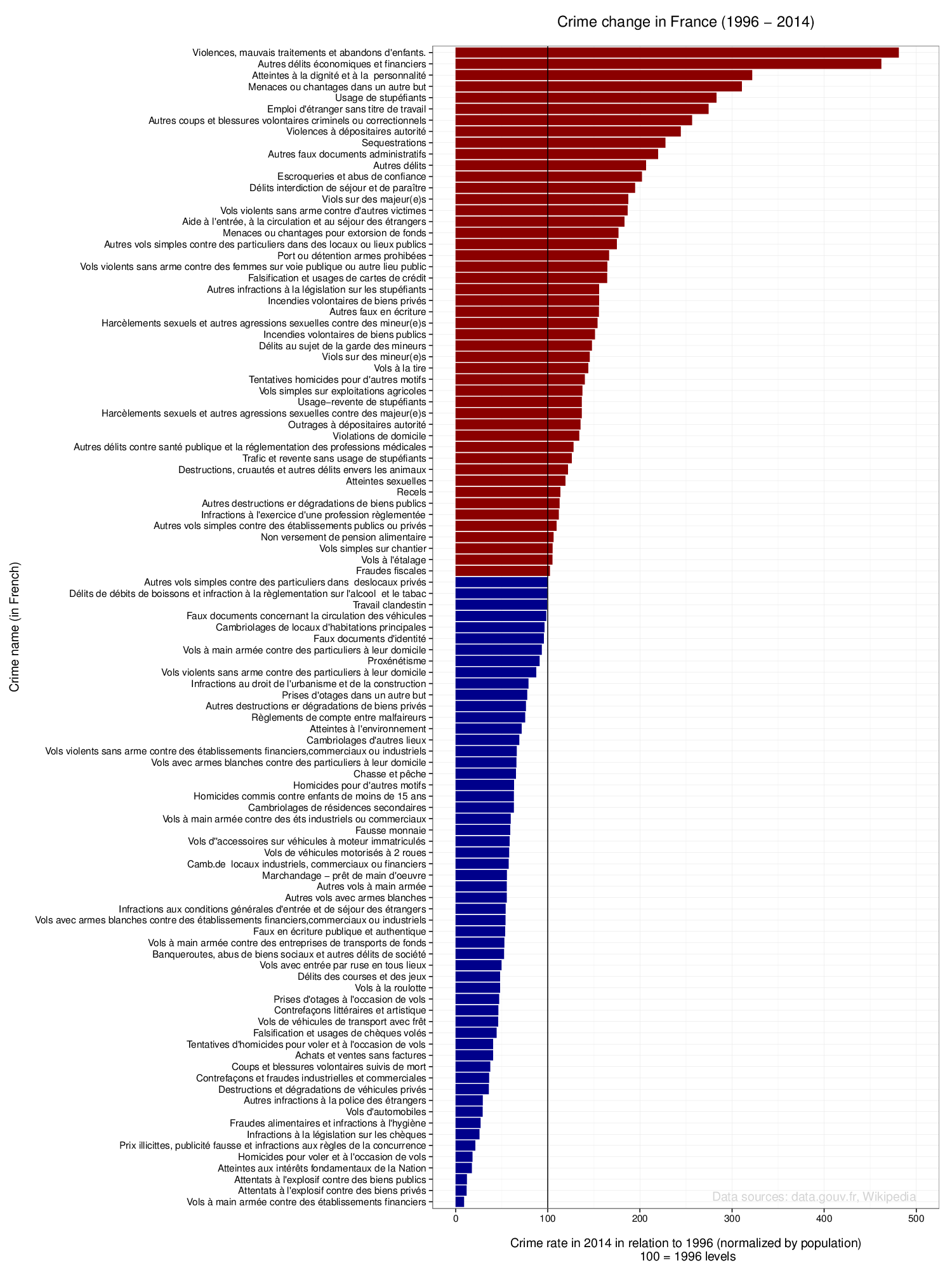
That's it. I created a last variable (col) in order to help me plot a better graph. I've also created a factor out of the Crime string, and have ordered it according to the normalized crime ratios (2014 normalized at 1996 levels, also taking the population into account). I can now call ggplot and build the final graph:
pltdiff <- ggplot(crime_diff) +
           geom_bar(aes(x = Crime, y = diff, fill = col),
                    stat = "identity") +
           scale_fill_manual(values = c("darkblue", "darkred")) +
           geom_hline(yintercept = 100) +
           coord_flip() +
           ggtitle("Crime change in France (1996 - 2014)\n") +
           xlab("Crime name (in French)\n") +
           ylab("\nCrime rate in 2014 in relation to 1996 (normalized by population)\n 100 = 1996 levels") +
           annotate("text", x = 1.5, y = 500,
                    label = "Data sources: data.gouv.fr, Wikipedia",
                    hjust = 1, color = "lightgray") +
           theme(legend.position="none")
print(pltdiff)
ggsave(pltdiff, filename = "/tmp/france_crime.pdf", height = 20, width = 15)
There are several elements in this plot: I've used the normalized crime rate to create a bar plot with two colors: red if crime is now higher, blue if lower. I also added a vertical line to better highlight the 100 mark (no change). I've also flipped the coordinates so that the labels are on the y-axis, and added some titles. I have also added a line to save the figure directly to a PDF file that changes every time I run the code, so I can see the result live and at the same time I have a vectorized copy ready to publish anywhere.
Without further ado, here is the final result (converted to PNG using convert -format png -density 100 france_crime.pdf france_crime.png):

A note of caution: this is reported crime, as the statistics come from the French police departments. Therefore, any increase in a specific crime means an increase in reported crime, which may or may not correlate with an actual increase in the related offense.