(You can find the original file used for this analysis in this github repository. Click here for the raw file.)
(Update: Iñaki has provided a version that uses dplyr to manipulate data.frames. Here it is.)
This is an R version of Learning Seattle’s Work Habits from Bicycle Counts. It more or less mimics the original Python code to offer an equivalent output. If all goes well, you might just run this .Rmd file and a nice HTML output will be generated.
Let’s start by importing all the necessary libraries.
library(RCurl)
library(ggplot2)
theme_set(theme_bw(12))
library(reshape2)
library(mclust)
# Output should not be in Spanish
Sys.setlocale(category = "LC_ALL", locale = "C")
# knitr options
library(knitr)
opts_chunk$set(fig.width = 10, fig.height = 7)
I'm loading the data directly using RCurl, without saving it to a temporary file. To avoid requesting it repeatedly (I had to run this code several times until everything was right, you know), I am doing two things:
- Do not reload the
datasetvariable if it already exists. - Tell R Markdown to cache this code block.
There we go:
if (!exists("dataset")) {
dataset <- getURI("https://data.seattle.gov/api/views/65db-xm6k/rows.csv?accessType=DOWNLOAD")
}

# Now, dataset is the raw .csv file. We need to create a data.frame with this
bikes <- read.csv(textConnection(dataset))

# How are we doing?
summary(bikes)
##                      Date       Fremont.Bridge.West.Sidewalk
##  03/08/2015 03:00:00 AM:    2   Min.   :  0
##  03/09/2014 03:00:00 AM:    2   1st Qu.:  7
##  03/10/2013 03:00:00 AM:    2   Median : 31
##  01/01/2013 01:00:00 AM:    1   Mean   : 56
##  01/01/2013 01:00:00 PM:    1   3rd Qu.: 75
##  01/01/2013 02:00:00 AM:    1   Max.   :698
##  (Other)               :24759   NA's   :7
##  Fremont.Bridge.East.Sidewalk
##  Min.   :  0.0
##  1st Qu.:  7.0
##  Median : 28.0
##  Mean   : 52.8
##  3rd Qu.: 66.0
##  Max.   :667.0
##  NA's   :7
# The date is not properly recognized. We can change that.
bikes$Date <- as.POSIXct(bikes$Date,
format = "%m/%d/%Y %r")
# Let's see now
summary(bikes) # OK!
##       Date                     Fremont.Bridge.West.Sidewalk
##  Min.   :2012-10-03 00:00:00   Min.   :  0
##  1st Qu.:2013-06-17 23:45:00   1st Qu.:  7
##  Median :2014-03-02 23:30:00   Median : 31
##  Mean   :2014-03-02 22:51:59   Mean   : 56
##  3rd Qu.:2014-11-15 23:15:00   3rd Qu.: 75
##  Max.   :2015-07-31 23:00:00   Max.   :698
##                                NA's   :7
##  Fremont.Bridge.East.Sidewalk
##  Min.   :  0.0
##  1st Qu.:  7.0
##  Median : 28.0
##  Mean   : 52.8
##  3rd Qu.: 66.0
##  Max.   :667.0
##  NA's   :7
# Data cleaning: names, NA values and Total column
names(bikes) <- c("Date", "West", "East")
bikes[is.na(bikes)] <- 0
bikes$Total <- with(bikes, West + East)
Ok, we have the data.frame ready. Let's try the first plot:
# We have to melt our data.frame to feed it to ggplot2
b1 <- melt(bikes, id.vars = c("Date"))
# And we want the weekly total. Let's do some aggregations.
b1$week <- format(b1$Date, format = "%Y-%U")
# Trips per week
b2 <- aggregate(value ~ week + variable, b1, sum)
# Let's plot on the first available date for that week.
b3 <- aggregate(Date ~ week + variable, b1, min)
# And merge all into a single data.frame
btot <- merge(b2, b3)
# Plotting function
pltweekly <- ggplot(btot) +
             geom_line(aes(x = Date, y = value, color = variable)) +
             ylab("Weekly trips")
pltweekly

So far, so good. It looks much simpler in Python. Perhaps there is some easier way of doing this in R with plyr or maybe cast and / or melt (just guessing), but this was just five lines of quite explicit code.
Now, let's create the X matrix.
# Need hour of the day and date without time.
bikes$hour <- strftime(bikes$Date, "%H")
bikes$Date2 <- as.Date(bikes$Date) # Do not destroy previous colum.n
X1 <- dcast(bikes, Date2 ~ hour, sum, fill = 0, value.var = c("East"))
X2 <- dcast(bikes, Date2 ~ hour, sum, fill = 0, value.var = c("West"))
X <- cbind(X1, X2[, -1])
dim(X)
## [1] 1033 49For some reason, our dataset has 1033 days, while the original one had 1001. This is funny, but doesn’t seem to affect the results. Perhaps the CSV file I am downloading has been updated contains with respect of the one used in the original post.
Time for the PCA now. The original article used two components, which contained 90 % of the variance of X. Let’s see if we have the same result.
pca1 <- prcomp(X[, -1])
cumvar <- cumsum(pca1$sdev^2 / sum(pca1$sdev^2))
cumvar[1:5]
## [1] 0.8259 0.8995 0.9277 0.9410 0.9510# The two first components have 0.8994963 of the variance. Ok, let's take those two.
Xpca <- pca1$x[, 1:2]
# Let's plot it
Xpca <- as.data.frame(Xpca)
names(Xpca) <- c("PC1", "PC2")
Xpca$total_trips <- rowSums(X[, -1])
Xpca$Date2 <- X$Date2
pltpca <- ggplot(Xpca) +
geom_point(aes(x = PC1, y = PC2, color = total_trips),
size = 4, alpha = 0.7) +
scale_colour_gradientn(colours = rev(rainbow(3)))
pltpca

Does not look bad. The x axis is inverted with respect to the original and can be easily fixed by switching the sign for PC1, but this is only an aesthetic detail. The data is describing exactly the same pattern.
The original post now used Gaussian Mixture Models to identify these two clouds. Instead, given that R already provides a very handy kmeans function, I am going to try that. This is a brief detour from the original route, but I promise it will be a short one. Let's see:
Xpca$clusters <- kmeans(Xpca[, c("PC1", "PC2")],
               centers = 2, iter.max = 100, nstart = 10)$cluster
# Did it work?
pltkmeans <- ggplot(Xpca) +
             geom_point(aes(x = PC1, y = PC2, color = factor(clusters))) +
             scale_color_manual(values = c("red", "blue"))
pltkmeans

The result is really bad. Let's use a proper GMM function (Mclust() from the mclust library):
Xpca$clusters <- Mclust(Xpca[, c("PC1", "PC2")], G = 2)$classification
pltkmeans <- ggplot(Xpca) +
             geom_point(aes(x = PC1, y = PC2, color = factor(clusters))) +
             scale_color_manual(values = c("red", "blue"))
pltkmeans
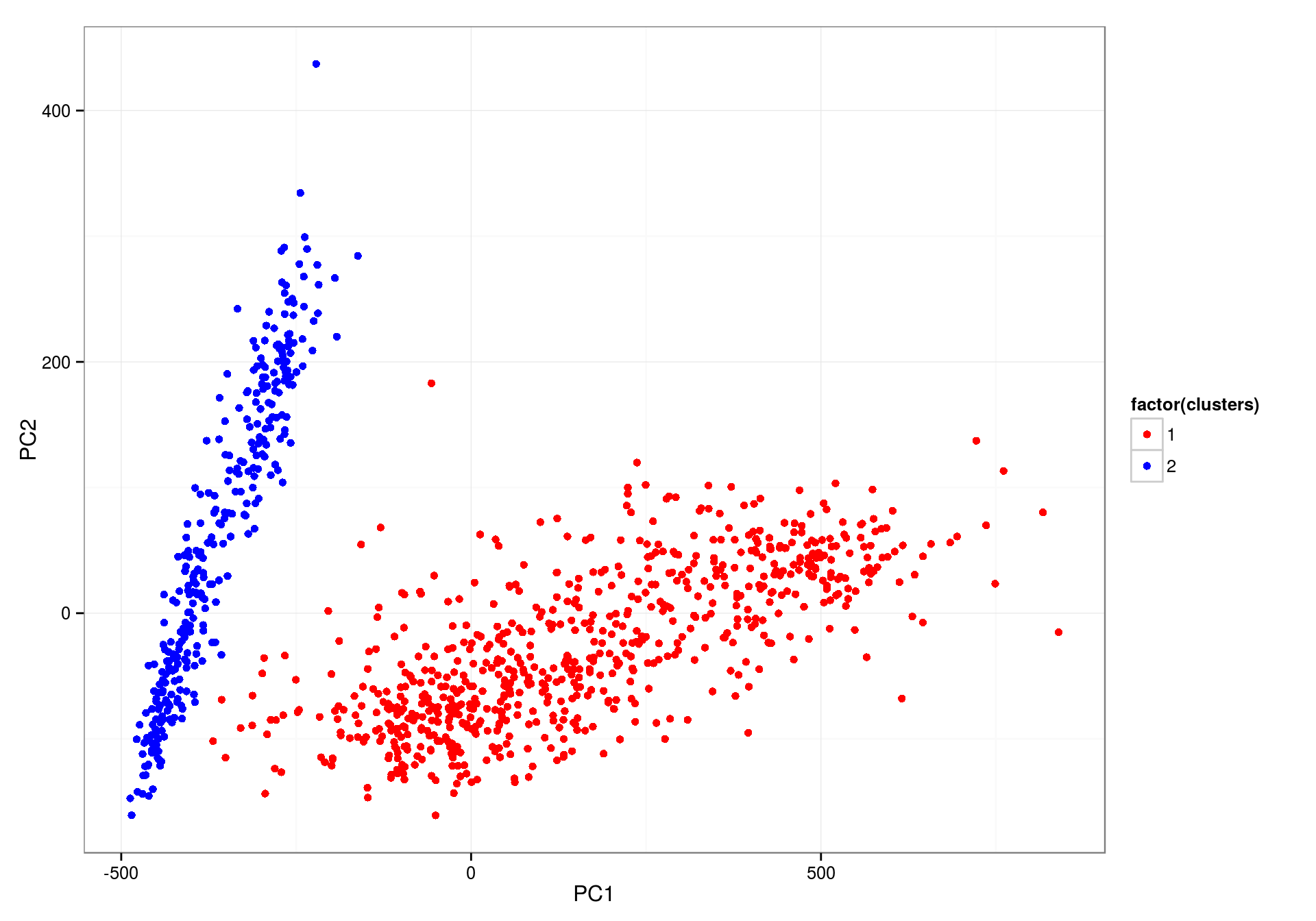
This is much better. Now let’s join the cluster classification on the original dataset and compute the average trends by hour.
bikes <- merge(bikes, Xpca[, c("clusters", "Date2")])
by_hour <- dcast(bikes, clusters ~ West, sum, fill = 0, value.var = c("West"))
by_hour <- aggregate(cbind(West, East, Total) ~ clusters + hour, bikes, mean)
# As before, melt for plotting
by_hour <- melt(by_hour, id.vars = c("hour", "clusters"))
by_hour$hour <- as.numeric(by_hour$hour)
pltavg <- ggplot(by_hour) +
          geom_line(aes(x = hour, y = value, group = variable, color = variable)) +
          facet_wrap(~ clusters) +
          xlab("Hour") + ylab("Average trips per hour\n")
pltavg
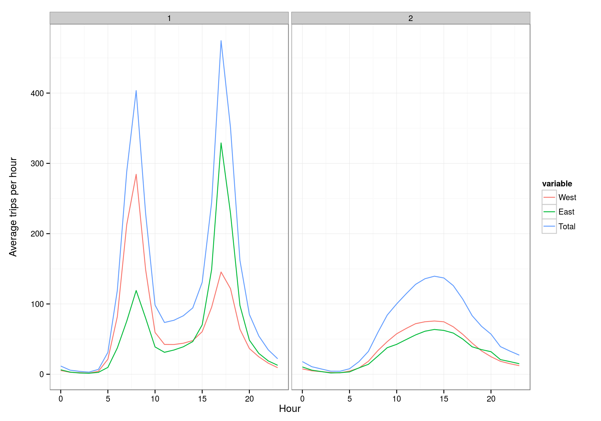
Good! We are seeing exactly the same behaviors as in the original post. The scales are the same for both plots, but this can be changed by using facet_wrap(~ clusters, scales = "free") instead of the actual function call.
So, let's go on with the different weekdays behavior.
# This uses the PCA'd data, so let's add a weekday column to that one
Xpca$weekday <- weekdays(Xpca$Date2)
Xpca$isweekend <- with(Xpca, weekday %in% c("Saturday", "Sunday"))
pltpca <- ggplot(Xpca) +
          geom_point(aes(x = PC1, y = PC2, color = weekday),
                     size = 4, alpha = 0.7) +
          scale_color_manual(values = rainbow(7))
pltpca

nrow(Xpca[Xpca$isweekend & Xpca$clusters == 1, ]) # 0, as expected
## [1] 0nrow(Xpca[!Xpca$isweekend & Xpca$clusters == 2, ]) # 24, original was 23, but here are more rows in this dataset
## [1] 24The plot looks fine. The three offending Fridays are there too:
Xpca[Xpca$weekday == "Friday" & Xpca$PC1 > 600, ]$Date2
## [1] "2013-05-17" "2014-05-16" "2015-05-15"I am stopping here. I could not find an easy way of obtaining US Federal holidays from any R function. I found the function holidayNYSE() in the timeDate library, but I understand holiday days in Seattle are not the same as holiday days in New York. I could try to get those from another source, but I could not find any other library to provide this; I could also generate the list by hand (using the NY list as a starting point) or scrape them from some webpage, but I feel that defeats the purpose of this exercise (just a bit.) Anyways, I am skipping the holiday days part from the original analysis.